Building strategy slide decks isn’t just about fancy charts and data. You also need to understand how to build conceptual or qualitative slides.
Fortunately, you only need to master a handful of conceptual slides. And these will be sufficient for communicating most qualitative insights. These include:
- Process, flow, and journey slides
- Matrixes
- Driver trees
- Ranges and sliders
- From-to slides
- Tables and heatmaps
- Text slides
In this article, we break down each type of qualitative slide and teach you exactly when and why to use each.
Processes, flows and journeys
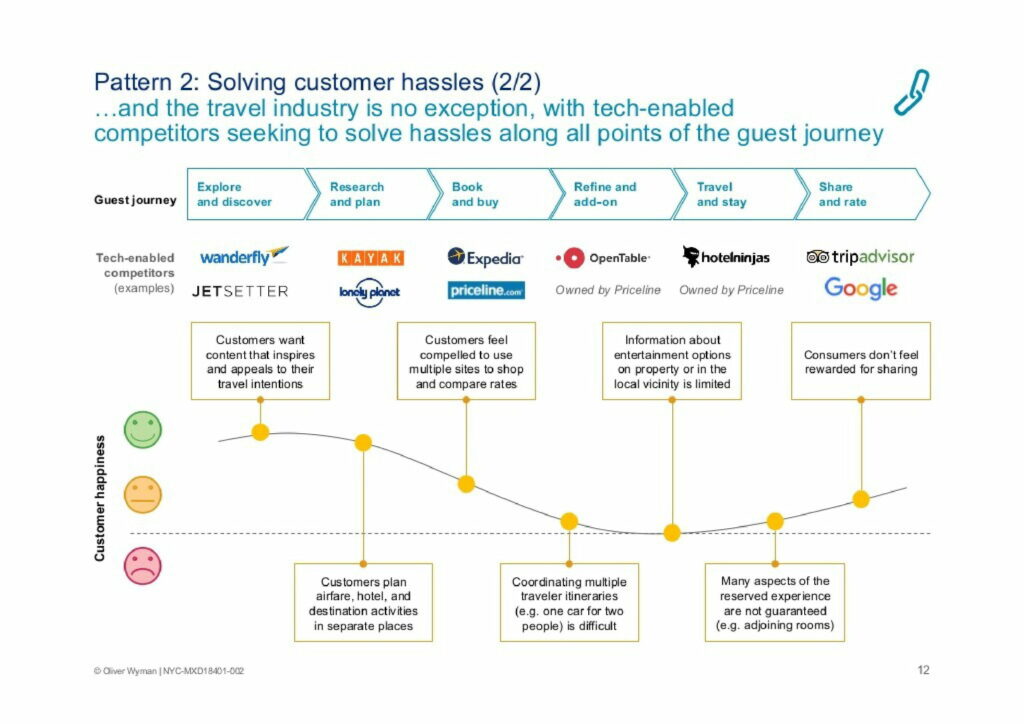
Process slides, flow slides, and journey slides are all used to show the effect of time. If you want to show an insight that has a time dimension, you should consider communicating it with a process, flow or journey.
In the slide above, Oliver Wyman is illustrating a travel guest’s journey from pre-travel research to post-travel review. Underneath, they highlight competitors and customer satisfaction at each stage of the journey.
Other common examples include customer journeys and the marketing funnel. You can see more examples of processes, flows and journeys in our slide library.
Matrixes
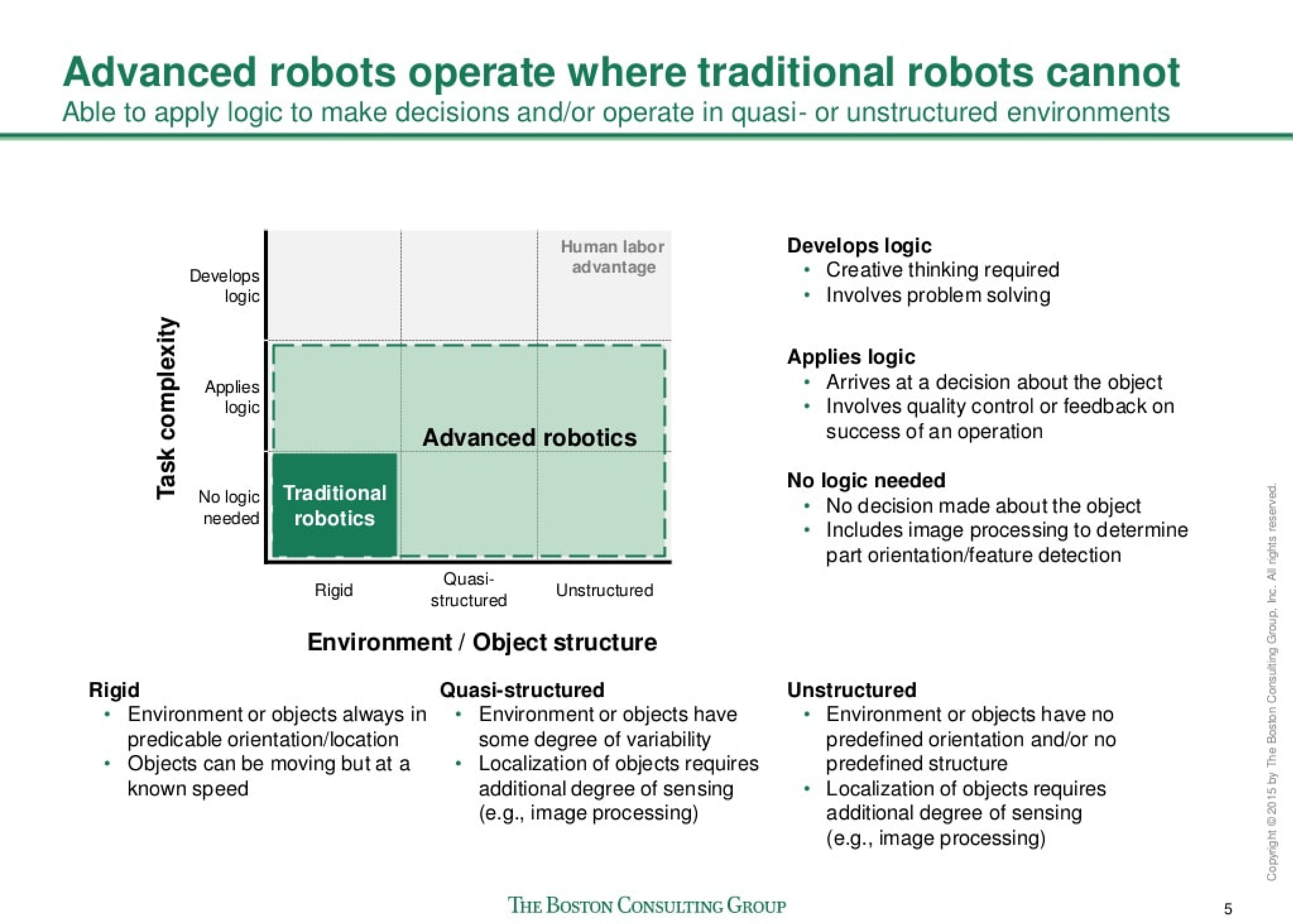
Matrixes are used to show how multiple concepts differ on two dimensions. They are useful because they show a full map of where those concepts could exist, as well as any overlap between the concepts.
For example, in the chart above, BCG are comparing traditional robotics and advanced robotics on the dimensions of task complexity and level of structure.
You can see more examples of matrixes in our slide library.
Driver trees
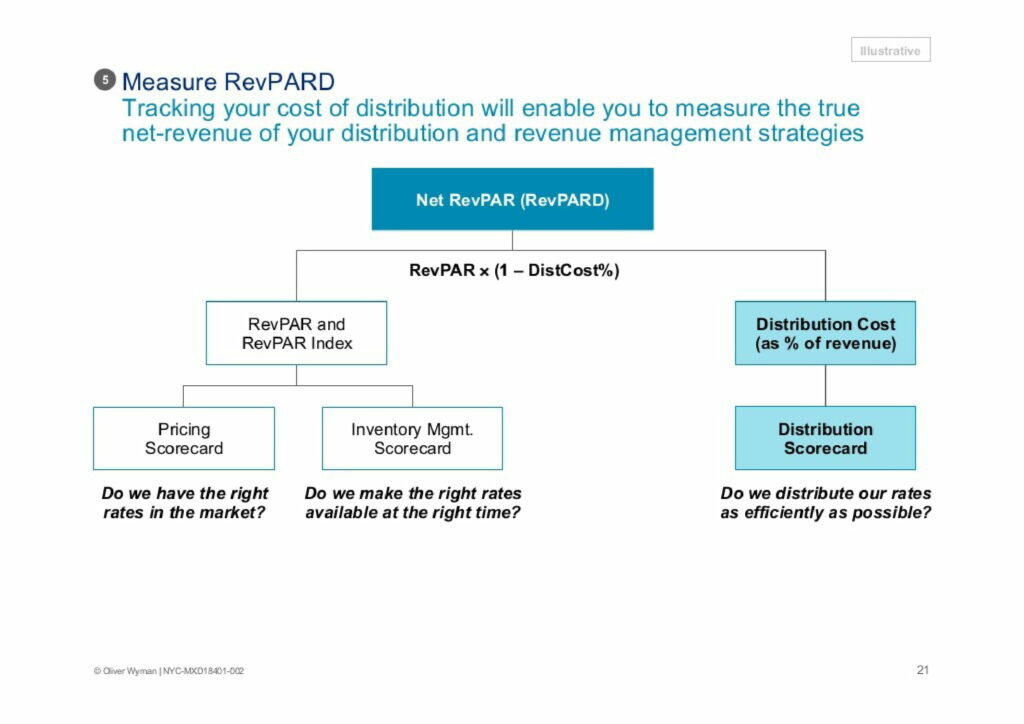
Driver trees are used to break down an outcome into the drivers or variables that influence it. You can continue to break down those drivers, which builds more and more branches of the tree.
These slides are most commonly used to break down a big, challenging problem into smaller, more manageable chunks. And in later slides, you’ll usually deep dive into each of the drivers in the tree.
In the slide above, you can see how Oliver Wyman broke down RevPARD into its drivers. And you can check out more examples of driver trees in our slide library.
Ranges and sliders
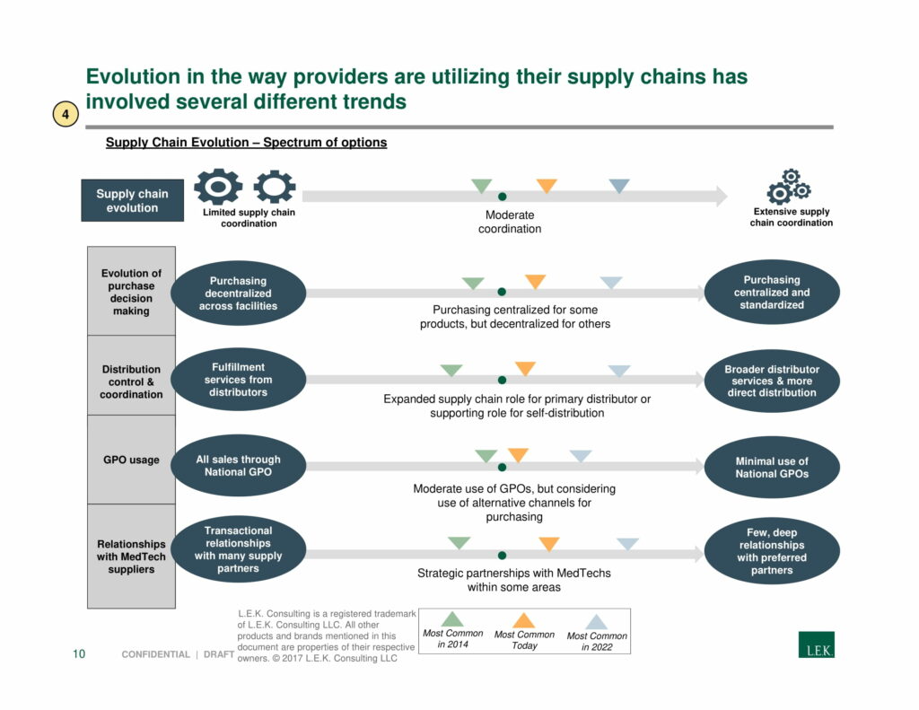
Ranges and sliders show where a particular metric sits on a dimension. They are used when you don’t have a quantitative metric (so you can’t use a chart) but you want to show the ‘relativity’ between different data points.
For example, in the slide above, L.E.K Consulting is comparing a number of metrics on the dimension of coordination. There is no quantitative measure of coordination, so they use a slider.
You can check out more examples of ranges and slides in our slide library.
From-to slides
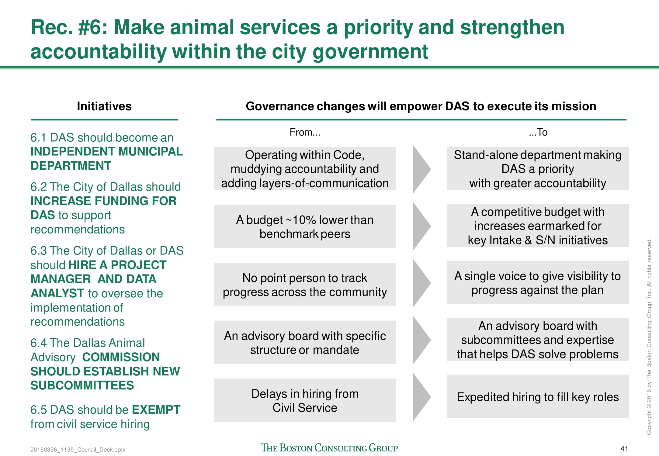
From-to slides are used to show how changes across a number of dimensions using text. First, you need to define a number of categories, then describe the current state, then describe the future state.
There are two common uses for from-to slides:
- You can use them as a context slide and then in later slides you can deep dive into how you’ll achieve the change
- You can use them to summarize the effect of an action or recommendation (like in the BCG example above)
You can check out more examples of from-to slides in our slide library.
Tables and heatmaps
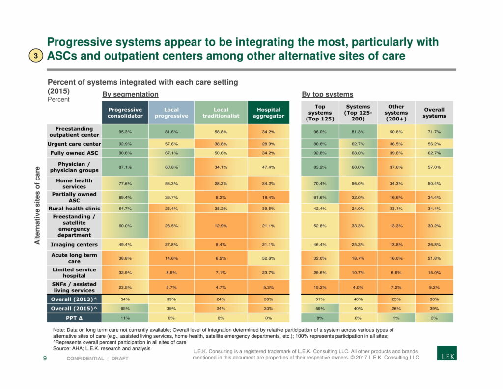
Many people argue that tables are not appropriate in slide decks. But that’s not quite right. Although they are often too dense to belong in the body of the slide, they fit quite well in an appendix.
Tables are a good way to summarize quantitative information. They are most commonly used to break down a calculation or show a complex quantitative output. Plus, you can turn your table into a heatmap by colorizing the cells based on their values.
You can check out more examples of tables and heatmaps in our slide library.
Text slides

Text slides are simply slides with text on them. But not all text slides are made the same.
The thing that differentiates good text slides from bad text slides is structure. Good text slides are structured in a way that makes it easy for the reader to understand the dense text. So think about how you can break up your text into logical groupings or categories.
For example, in the L.E.K Consulting example above, they’ve categorized six key trends and structured their text into two groups: a description of the trend and the implication of the trend. They’ve also used icons to break up the text.
You can check out more examples of text slides in our slide library.
