There’s something different about slide decks from strategy consulting firms like McKinsey, Bain or BCG. For some reason, they just seem more convincing. But it’s difficult to pinpoint exactly what makes those presentations good.
As a strategy consultant, you very quickly realize there are two important components of a compelling strategy presentation:
- The ‘thinking’. This is the rigorous problem definition, analysis, synthesis, and insight that happens before you open up PowerPoint. Without this, even the most well-crafted strategy presentation lacks impact.
- The presentation. This is the distinctive, structured, and clear way that strategy consultants build their slide decks. Without this, even the most powerful insights lose their force.
In this guide, we show you how to do both those things. In chapters 1-3, we discuss how to structure your slide deck, define your objective, and craft a compelling argument and storyline.
Then in chapters 4-6, we show you best practices for building your slides and reviewing your slide deck.
By the end of this guide, you’ll have the ability to craft a compelling strategy slide deck with a clear and compelling storyline that leads your audience to your desired conclusion.
Structure your slide deck
Before we get into the detail of building your slide deck, it’s important to understand how to structure your presentation.
There is a common structure that is used for almost all strategy presentations. It’s based on a concept known as the Pyramid Principle, which was popularized by Barbara Minto at McKinsey & Co.
According to Minto, there are three components to a well-constructed slide deck:
- The executive summary: Provides the reader a full summary of the argument and recommendations within your slide deck for readers that are more interested in the ‘so what’ than the detailed analysis.
- The body slides: Illustrates the analysis that supports each claim you make in your slide deck’s argument and thus slide objective.
- Next steps or recommendations slides: Clearly outlines the key implications or ‘so what’ of your slide deck, as well as any next steps required.
In this guide, we will walk you through how to tackle each of these sections one by one. But first, we start by setting the objective of your slide deck, and crafting your argument and storyline.
Define the objective of your deck
Let’s start at the beginning. The purpose of your slide deck isn’t to show off all the things you know… or how great you are at analysis… or how beautiful your slides are.
Instead, the purpose of your slide deck is to persuade your audience and lead them to an objective. And, as the author of the slide deck, you need to set the objective before you start building your slide deck.
Having a clear objective for your slide deck is important for a number of reasons:
- It helps you focus your research and analysis on things that are relevant to your objective.
- You can quickly test the quality of your content by testing whether it is sufficient to achieve your objective.
- It helps inform the tone and positioning of the messages in your slides.
Your objective can take many forms. For example, it could be simply to inform your audience, to gain endorsement for a decision, or to achieve a specific action or next step.
As the author of the slide deck, you must ensure that the objective is clear and agreed upon. All the work that you’re about to do to build your slide deck is guided by your objective.
Craft the argument and storyline
Now that you’ve determined the objective of your slide deck, you need to craft an argument and storyline that leads to your objective.
To some extent, your slide deck’s argument will naturally appear from insights gathered through research and analysis. As you conduct research, you’ll slowly uncover the “real state of affairs”, which will be supported by data.
It’s your job to translate this argument into a compelling story; one that grabs the attention of your reader and communicates your argument in a clear and easy-to-understand way.
To do this, you should use a situation-complication-resolution storyline.
This is a universal structure; it’s used in books, plays, films, advertising, religion, politics, and more. It looks something like this:
- The scene is set and the characters are introduced (situation)
- Something goes wrong (complication)
- They fix the problem and live happily ever after (resolution)
When storytelling in PowerPoint, you should use the same structure. But in the context of your slide deck, your storyline will look something like:
- This thing is important (situation)
- There is a problem with this thing (complication)
- Therefore, we need to respond — and here is how (resolution)
The dot-dash structure
Writing a storyline for your presentation doesn’t happen in PowerPoint. In fact, you don’t open up PowerPoint until you’re completely satisfied with your storyline.
Instead of jumping into PowerPoint, you start by writing out your storyline in a text document using the dot-dash structure.
By writing your slide deck’s storyline in a text document, you can easily identify any faulty or missing logic in your story and ensure that you have the data required to support each claim you make.
And when you’re completely satisfied with your storyline, you can move it into PowerPoint. Your storyline should be communicated in the slide lead-ins, like so:
And once you’ve built the skeleton of your slide deck with the storyline communicated “horizontally” across the leads-ins, you’re ready to start building individual slides and the “vertical flow”.
Build body slides
Before you jump into building individual slides, there are two main components of slides that you need to understand:
- The lead-in: The text at the top of your slide. This should be written as an action title that communicates the implication or ‘so what’ of the slide, not describes the content of the slide.
- The slide body: The content of your slide. You should only communicate one insight per slide and choose the simplest method possible.

There is a close relationship between the slide lead-in and slide body. And this relationship is best explained by the Golden Rule of slide building.
The Golden Rule of slide building is:
“One slide, one insight, fully articulated in the lead-in, and supported by the body”
In other words, each slide should only communicate one insight. That insight should be fully explained in words in the lead-in, and fully supported by data in the slide body.
In addition, there should be nothing in the lead-in that’s not in the body, and nothing in the body that’s not in the lead-in.
Data, charts, and other quantitative slides
Claims that are supported by data are naturally more compelling than claims supported by ‘expert’ opinions, focus groups, and other qualitative evidence.
Therefore, where possible, you should always prioritize quantitative slides over qualitative slides.
But don’t go overboard with your data visualization. Sometimes it can be tempting to show off our technical skills by choosing the most complex visualization available. This is bad practice.
Instead, you should always choose the simplest chart to demonstrate your insight. But it can be tricky to determine which chart to use. So we’ve put together a simple decision tree to ensure that you always choose the most appropriate chart for your data.
Text, conceptual, and other qualitative slides
There are some insights that simply cannot be communicated with charts or data. In these cases, you need to find the most appropriate conceptual chart.
Unlike qualitative slides, there are no simple guides for text and conceptual slides. And because of this, the ability to craft well-structured conceptual slides is the mark of a skilled consultant.
It’s surprisingly tricky to be able to communicate a qualitative insight in a clear and structured visual manner. The best way to build the skill is to practice. But you can also learn by exploring common qualitative slides used by strategy consultants.
Write the executive summary
An executive summary slide is the first slide in your presentation but the last slide you build.
The executive summary slide fully summarizes the argument, storyline, and supporting evidence of the body slides. Because we already need to have finished every other part of the slide deck, we write it last.
Executive summary slides help the reader “follow along” with your slide deck. There are a few main benefits:
- They provide context to help the reader understand why the topic of the slide deck is important.
- They communicate the high-level argument before the reader gets into the body of the slide deck. This helps the reader understand your more detailed body slides.
- They are a “map” that the reader can reference back to if they start losing the line of argument in the body of the deck.
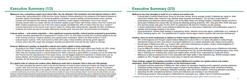
A typical executive summary looks something like the following slides, which are from a BCG report on “Melbourne as a Global Cultural Destination” and can be downloaded here.

Good executive summaries follow three best practices:
- They are structured with bolded text for summary sentences and bullet points for supporting data. This ensures that every claim is clearly supported by data.
- The bolded summary sentences can be read alone to tell the slide’s storyline (i.e. you don’t need to read the supporting data in the bullet points).
- The bolded summary sentences reflect the SCR storyline structure of the slide deck
One other good practice (that you don’t see in the BCG example) is to reference the associated body slide throughout the executive summary. This helps direct a reader to the detailed analysis behind every claim in the executive summary.
Review your slide deck
Now that you’ve finished building all your slides and writing your executive summary, it’s time to review and finalize your slide deck.
There are three things that you need to check as you review your slide deck:
- Chart completeness: Check that your charts are comprehensively labeled, including chart titles, axis labels, units, time periods, etc.
- Text brevity: Review your slide text, including your lead-ins, and ensure that you make your points with the minimum number of words possible.
- Slide consistency: Review your slides and ensure that there is consistent formatting across the slides.
Reviewing your charts and visualizations
There’s a surprising amount of detail contained in charts and it’s quite easy to forget to key include key information.
Some examples of common charting mistakes include missing chart titles, labels, axes, units, dates, and legends. You should also consider how you highlights the implication of your charts.
To make this easier, you should use a charting checklist to methodically cross-reference your chart with best practice.
Refining your slide text
There’s an important place for text in slides. Not only can your use text to provide important context to support your visualizations, but also to communicate insights without data.
Most people use too many words in their slides. They tend to use fancy “consulting speak” or long, verbose explanations that actually obsure their message.
As you review your slide deck, you should review all of the text in your slides and savagely sharpen your text by removing unnecessary words.
Ensuring consistency across slides
Finally, you should use your last review to check for consistency across slides.
Start by ensuring that the formatting is consistent. For example, your slide format, spacing, fonts and slide numbers should all be consistent across the slides.
And then finish your review by ensuring all concepts are communicated consistently across slides. For example, if you’ve numbered or colored concepts a certain way, then ensure that they remain consistent throughout your slide deck.
