What is a Mekko chart?
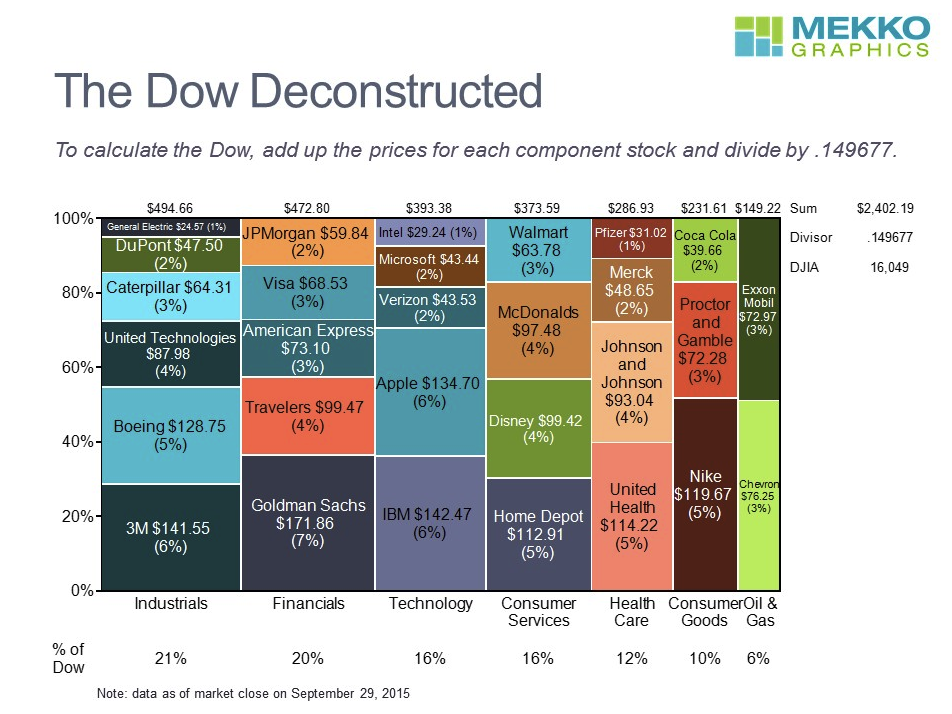
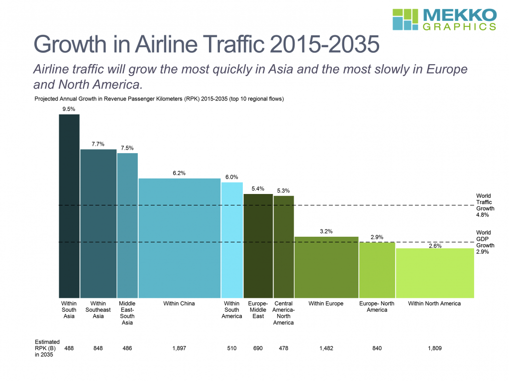
A Mekko chart (also known as a Marimekko chart) is a two-dimensional stacked chart with varying column widths.
The easiest way to imagine a Mekko chart is to think of a column chart with no gaps between the columns and variable column widths. Each column can be a standalone or a stacked column that contains multiple series.
There are two types of Mekko charts:
- Marimekko chart: A chart with columns that are all 100% height but have variable widths.
- Bar Mekko chart: A chart with columns that have variable heights and variable widths.
When should you use them?
Mekko charts are commonly used in strategy consulting presentations because they are a quick way to show multiple insights in a single visualization.
Marimekko charts are most commonly used when you have two categorical variables (e.g. industry and company), one quantitative variable (e.g. market capitalization), and want to compare each category as a percentage.

Bar Mekko charts are most commonly used when you have one categorical variable (e.g. country), and two quantitative variables (e.g. annual revenue growth and revenue).

Criticisms of Mekko charts
Although Mekko charts are quite common in consulting presentations, they have a number of criticisms:
- They are difficult to interpret. People are good comparing distances (e.g. in a bar or column chart) but not very good at comparing areas (e.g. in a Mekko chart). Because of this, it takes longer for people to interpret Mekko charts.
- You can’t include many categories or groups. Mekko charts get extremely cluttered when there are two many categories and/or groups. In particular, it becomes difficult to include readable labels.
- There is almost always a simpler alternative. No matter what you’re trying to communicate with your Mekko chart, there’s generally a simpler way to show that same insight. Sometimes it might take two separate charts; but even that can be easier to understand than a Mekko chart.
How to create a Mekko chart in PowerPoint
Excel and PowerPoint do not support Mekko charts natively. There are ways to create a Mekko chart in Excel and PowerPoint but they require you to create a stacked areas chart and apply some hacks to make it look like a Mekko chart.
The better way is to use a PowerPoint charting add-in to create a Mekko chart.
There are a few add-ins that support Mekko charts, including Think-Cell, Empower Suite, Grunt Pro and Mekko Graphics. But in my experience, the most powerful PowerPoint charting add-on is Think-Cell.
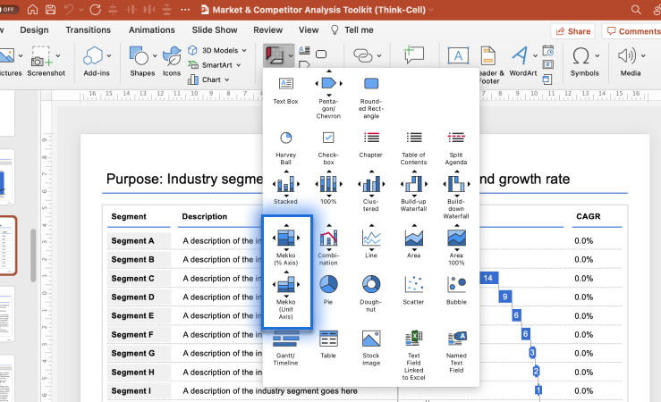
In the image below, you can see an example of me adding a Mekko chart to the Market & Competitor Analysis Template Pack.

To create a Mekko chart using Think-Cell:
- Click on
Inserton the PowerPoint ribbon - Click on
Elementsin the Think-Cell section - Click on either
Mekko (% Axis)orMekko (Unit Axis)and then drop the chart onto your slide canvas - When the data sheet appears, insert the data for your Mekko chart
If you’d like to learn more about using Mekko chart with Think-Cell, check out my YouTube video: The Ultimate Guide to Mekko Charts in Think Cell
