Have you ever stared at your blank slide canvas and didn’t know where to start?
We’ve all been there. It can be hard to figure out how to translate your data into a compelling chart.
Don’t worry, in this article we’re going to show you how to effortlessly determine the best chart for your data or insight.
Bad charting confuses your reader
Let’s start by quickly touching on why it’s important to spend time choosing the best chart for your data.
Ultimately, the purpose of your slide deck is to achieve a pre-defined outcome. Your slide deck will communicate a compelling argument that logically leads your reader to the conclusion you want.
The role of each slide, and the charts on them, is to support different points of your argument.
So if you choose the wrong chart for your data, then your reader could lose the thread of your argument. Worst-case scenario, they could start doubting the accuracy of your conclusion.
Therefore, it’s important that you spend the time to determine the most appropriate chart to communicate your argument and the data that supports it.
As an aside, if you’d like to learn more about how to build a compelling strategy consulting slide deck from scratch (and where charting fits into the overall picture), check out our Complete Guide to Building Strategy Presentations.
There are only four insights you can show with charts
Fortunately, choosing the right chart for your data isn’t actually that difficult.
In fact, fundamentally, there are only four insights that you can show with charts. These are:
- Comparisons: How one dataset is similar to or different from another dataset. For example, comparing the revenue of Company A with the revenue of Company B.
- Relationships: How changes in one dataset correspond to changes in another dataset. For example, the increases in ice-cream sales as temperate increases.
- Distributions: How a dataset is distributed over time or another variable. For example, the range of salaries of a cohort of employees.
- Compositions: The breakdown of a dataset into the parts that make it up. For example, the underlying drivers of cost growth.
You can illustrate most data with only four chart types
To understand which chart type you should use for your data, you simply need to identify the insight you’re trying to show (e.g. relationship) and then a couple of additional things, such as the number of variables or time periods in your data.
But instead of trying to explain the theory, we’ve put together a charting decision tree to make it really easy to select the most appropriate chart for your data:
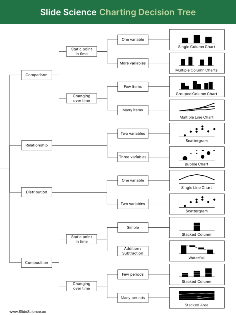
As you can see in the decision tree above, only really need four different chart types to show almost any insight:
- Bar charts and column charts (as well as variations like the stacked column chart and grouped column chart) are particularly useful to show comparisons and simple compositions.
- Line charts and area charts can be used to distributions and complex compositions with many variables or over a long time period.
- Scatter charts and bubble charts are most often used to show relationships; scatter charts show a relationship between two variables and bubble charts show a relationship between three variables.
- Waterfall charts are used to show composition, especially the composition of a change, where you want to show addition or subtraction over time.
You might notice that there’s no mention of pie charts or doughnut charts. I’ve always been told to use stacked column or stacked bar charts, instead of pie charts, as they are more intuitive when comparing proportions.
Examples of good charting
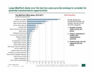
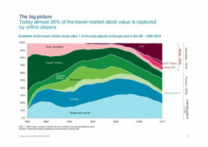
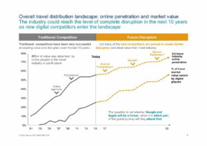
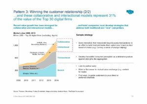
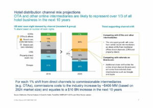
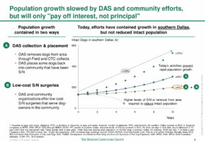
From my perspective, one of the best ways to learn is to see examples of good charting. Below you’ll find a random selection of consulting slides from McKinsey & Co, Boston Consulting Group, L.E.K Consulting, and Oliver Wyman.
These are real-world examples of how these strategy consulting firms use charts in their decks:
If you’d like to see more consulting slide decks like this, check out our free strategy slide library.

